During the implementation of the left nav changes as outlined here we've discovered several points that require further discussion. Because the resource renaming is a part of the effort as well, I lumped it together even though it could make for a discussion of its own. Below is a list of what we've found so far.
Search results are hard to make sense of
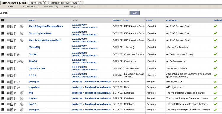
As a consequence of resource names simplification, as drafted here and detailed here, the search results are quite hard to visually navigate through. There's a couple of problems detailed below. We should build a big inventory with at least 10-20 JBossAS's, each deployed with the same applications so that we can test the L&F of the results in the "worst" conditions (large number of similar resources with the same names).
Resource type far away from the resource name
Because we removed the type information from the names, it is not apparent from the name itself what you're looking at. Only the resource type (and ancestry) will give you a better idea just what a "jon231" or "0.0.0.0" is. An image makes for a thousand words:
Naming is inconsistent
When we started the resource names simplification, we went on case by case basis through the resource types. That's why we kind of lost the "big picture" of how the resource names are going to look like when displayed together. Maybe it could be useful to come up with some conventions on naming the resources like "servers shall be called by their binding address and port".
No type information on parents
In some cases, it is not clear from the resource name, resource type and parent name what the resource really is. Consider the following screenshot:
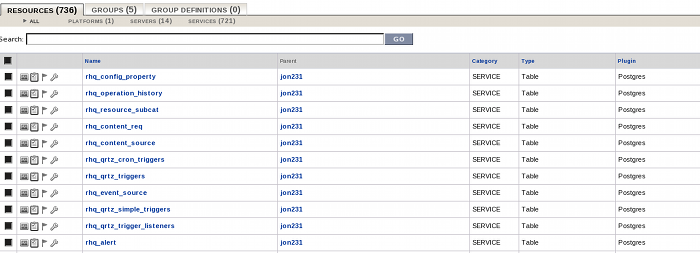
The fact that jon231 is a postgres database can only be deduced from the fact that the table resource is defined by the postgres plugin, which is a little bit unintuitive.
Navigation tree not optimal
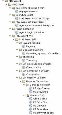
"Singleton vs. autogroups" problem
Certain resource types are marked as singletons meaning that there is ever going to be at most one resource of that type under given parent. If we follow the policy to create an autogroup even if there is only one child of given type (to make the tree look consistent) we create unnecessary level of indirection for singletons. Moreover, IMHO it is only logical to call the singleton resources the same name as their resource types (why call them something else if there is ever going to be just one of them?).
The following screenshot shows how RHQ Agent looks in the tree now. Note that the RHQ Agent as well as all of its sub-resources are singletons:
Availability warnings don't bubble up
This has never been fully agreed upon but with the removal of color-coding (one of the reqs) we lost all the visual clues of availability problems. We either have to come up with some other way of showing the problematic resources or we should re-add the visual clues to the tree, be it the color-coding or some kind of icon overlays.
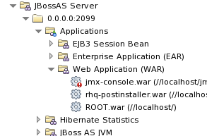
The following screenshot illustrates the situation as it exists now:
Inconsistent use of folder icon
This is only a problem from a certain point of view. Right now (as witnessed by the screenshots all around) we use the folder icon for the following:
-
autogroup (with a "gray-boxes" overlay)
-
sub-category (with a "various-shapes" overlay)
-
resource with children
and we use the gear icon for:
-
the resource without children
If you consider the fact that something has children more important than the fact that something is a resource and something isn't than this isn't a problem. If we wanted to stress the "type" of the node (i.e. can I collect metrics on this?) then it is confusing.
Dashboard
Dashboard is the new landing page
Is this the intended behaviour or will we rather revert back to the original landing page?
Resource names not disambiguated in the portlets
The dashboard has been left out from the disambiguation effort. If the dashboard as it is is going to stay, we need to finish it.